01 Jul WITH THE NEW CHIANTI DOCG LABEL WE HAVE WON!
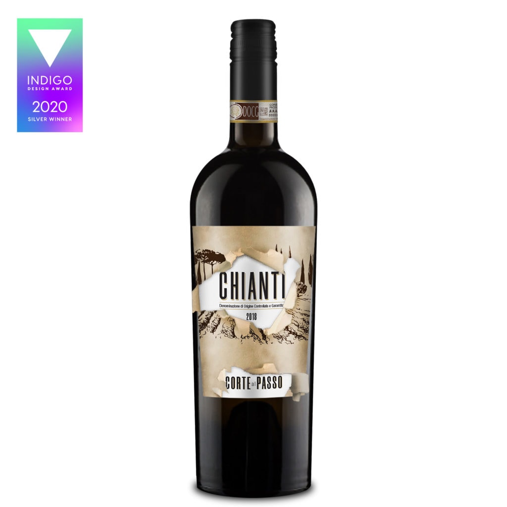
Our graphic design for the new CHIANTI DOCG Corte al Passo has just won a Silver Award at IndigoAwards 2020 in the Packaging Design category. This year, the competition received thousands of projects from over 20 countries and only 81 of them received an award.

The new CHIANTI DOCG Corte al Passo, and its related label, were created following a change in the production regulations for the Chianti Docg. This provides for the possibility of adopting a new sugar limit starting from the 2019-20 harvest. Now Tuscan companies will be able to comply with European regulations and produce high quality wines, more satisfying the tastes of foreign markets, especially in the United States, South America and Orientals.

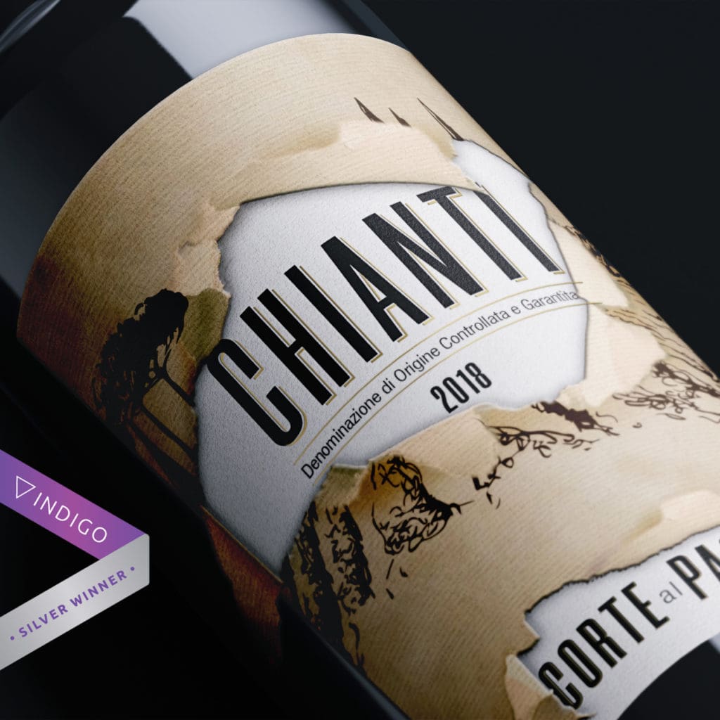
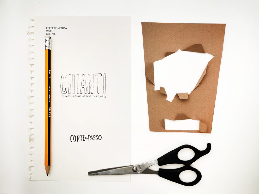
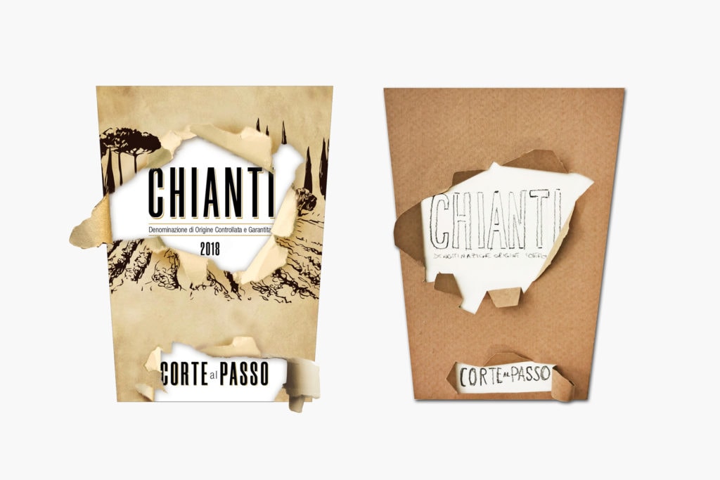
“To create this label, we took inspiration from traditional Italian and French wine labels, examples of quality and long-aging products. But the classic label is torn at various points and underneath it allows a new, more modern and contemporary one to appear”.
Giulio Patrizi, Founder and Creative Director

The label produced is printed on a single type of paper and the double support effect is simulated with a skilful use of the debossing technique. Using a matrix, controlled pressure is applied in the white area of the label, this allows you to create a depression and change the marking of the paper. In this way the label seems to be obtained by joining two different supports.


